Introduction
Hello. This article will introduce you on the basic guidelines of web typography. A collection of simple concepts that only takes a few lines of CSS to implement. Please note that this is just a guide to help you achieve better readability and not to be taken religiously. Feel free to implement your own idea if you'd like to showcase a unique look or for just fun experimentation.
To help you understand the difference, this page will serve as a interactive demo while we go each through of the guides.
Before we start, let's move a bit from the browser's edge, shall we?
Click the button at the bottom right of the page to implement style guides on this page.
Or if you're quite impatient:
Visual Heirarchy
Implementing a proper structure heirarchy on your page will already show a significant impact on its readability. This will show what needs to be emphasized; and to guide users on the overall composition of the page.
In order to do this, let's break down the containing elements:
- Header
- Paragraphs
- Images
- Lists
- Quotes / Blockquotes
- Etc.
Headers
Headers or headings are the most important part an article. A sub-heading, just like a paragraph, are used to seperate different ideas, and subsections of the same topic. The HTML nodes from h1 to h6 should be used for the relevant contexts.
	Heading 1
	Heading 2
	Heading 3
	Heading 4
	Heading 5
	Heading 6
Using CSS, you can implement different font-size for each node. Using ratio of 1.4, I was able to have a modular scale for my headers.
	h1 { font-size: 5.378em; }
	h2 { font-size: 3.842em; }
	h3 { font-size: 2.744em; }
	h4 { font-size: 1.96em; }
	h5 { font-size: 1.40em; }
	h6 { font-size: 1.00em; }
Relevant Links:
Headers also serves as a guide for Google, Yahoo, Bing, and other search engines to read or crawl your website to analyze its content and rank it according to relevance. So, if you'd like an additional SEO boosts, I insist you use the proper HTML5 semantics.
Paragraph
Paragraphs should be short and sweet. Make it approachable and easily digestible. The line-height and margin-bottom property will provide breathing room and space for your paragraphs. Setting the line-height value of at least 1.4 should be enough (this should scale-up depending on your font-size).
	p {
	  font-size: 1em; // 16px
	  line-height: 1.4;
	  margin-bottom: 1.4em;
	}
Relevant Links
Containers
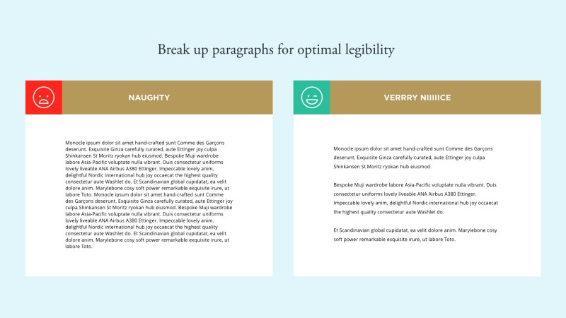
A proper composure for your page layout also plays an important role for readability. Keeping the container to an optimal length that should ease the eye movements of the reader.
- Too wide - if the line is too long, the reader will have a hard time focusing on the text.
- Too short - a short line could break the reader's rhythm and might even cause stress.
One pointer is to keep it between 50―70 characters per line. So, using the most common font-sizes of 16―22 pixels, you might end up between 500―750 pixels.
If you're on mobile though, the width will stay at 100%.
Fonts & Colors
Fonts
An optional but highly recommended part of typography. This is where you get creative, express, and implement your own style. Using certain fonts can set the mood and tone of your text. Usually, it is adviced that you only use a variety of 3 or less fonts. Too many might add confusion and clutter your reader's visual perception. More fonts would also rack-up the loading time of your page.
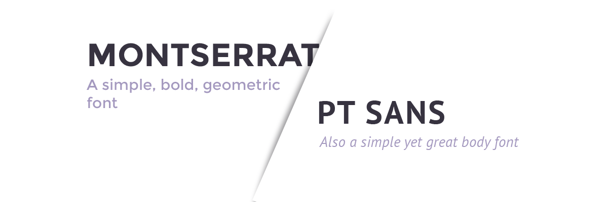
This demo used Droid Sans―serif font and Merriweather Sans―sans-serif font.
You are free to select your own combinations or pair. See and feel which fonts would create a perfect harmony.
Relevant Links
- Google Fonts
- Brick Fonts
- Dotcolon
- Create your own font
- An Inventory Of Typography Tools
- Sans vs Sans-serif
- A Comprehensive Guide on Loading Fonts
- Typenugget
- Typeanything
- Find your font
- 100 Days of Fonts
- Google Web Fonts Inspirations
- FontFlame - A Tinder-like app for fonts
- Typespiration
- Fonts That Go Together
CSS Font Style Generators
Font Inspirations
Colors
You might not notice the difference in color when you clicked that button but I assure you even just a little, I did a small relief on your eyes by optimizing the contrast between the font-color and the background-color.
Instead of using pure black #000000, I've added a bit of grey to the body by using #363636 for the paragraph and #202020 for the headers.
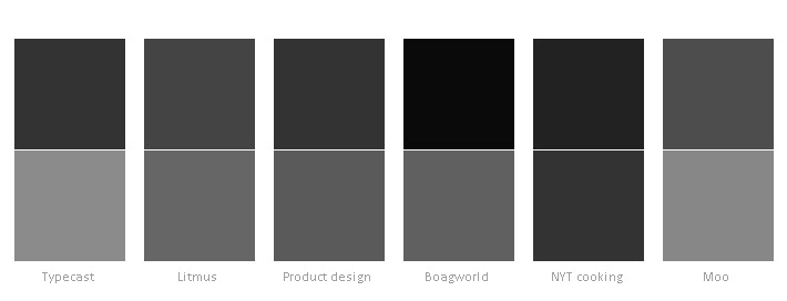
And that's the basic guideline of readability - a readable contrast. However, you can use any color of your preference on your article. Should it be your theme, custom color palette or just any color that fits your style. As long as it has a proper contrast ratio. Enough to be readable.
Relevant Links:
- Contrast Checker
- Google Material Color Guideline
- ColorCubo
- Adobe Color Palette Generator
- Colorhunt
- Colorsuplyyy
- Palettable
- Colordot
- Impalette (Palette generator from photos)
- Hello Color (Contrast safe color pairs)
- Colorhexa - Comprehensive Color Information
- Colorion
- Color Lisa
- Flat Colors
- Color Crush
- Color Claim by Tobias van Schneider
- Designing in Color by Jonathan Z. White
- The Psychology of Color in Marketing and Branding by Gregory Ciotti
Color Palette Generators
Color Inspirations
More Color Guides
Details
Adding tasty details might not be your thing but it is a welcome one. These mini-snippets on your CSS can define your style and uniqueness to your blog and/or article. A simple underline, or a border can add even more emphasis to your message.
To be continued...
Relevant Links:
- Typography Handbook -- This is all you need tbh dump everything else.
- Web Design is 95% Typography
- Fluid Typography using CSS
- Also a basic web typography guide
- Mathematics of Web Typoghraphy